Page 119 - WCS - Electrical
P. 119
WORKSHOP CALCULATION & SCIENCE  - CITS


           Pie chart

           A pie chart is a circular statistical graphic that is divided into slices to illustrate numerical proportions. Each slice
           represents a proportion of the whole, and the size of each slice is proportional to the quantity it represents. Pie
           charts are commonly used to show the composition of a total amount and are effective in displaying data with a
           small number of categories. In a pie chart:
           The entire ‘’pie” represents 100% of the data.
           Each slice represents a percentage or proportion of the whole. The slices are typically labelled with the category
           they represent.The angles of the slices are proportional to the percentages they represent. Pie charts are useful
           for visually comparing the sizes of different categories or showing the relationship between parts and the whole.
           They are commonly used in business presentations, research reports, and educational settings to present data in
           a clear and easily understandable way.

           Example
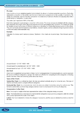
           Calculate the money spent various purposes. Numbers in the charts are in percentage. Total Amount spent is
           4000


           Amount Saved = 21/100 * 4000 = 840

           Amount spent for entertainment= 42/100 * 4000 = 1680
           Amount spent for food = 37 /100 * 4000 = 1480
           Bar Chart
           A bar chart is a graphical representation of data in which rectangular bars of varying lengths are used to represent
           the values of different categories or groups. Bar charts are effective for comparing discrete categories or showing
           trends over time. Here are some key points about bar charts:
           Types of Bar Charts

           Vertical Bar Chart: In a vertical bar chart, the bars are plotted vertically along the horizontal axis. This type of
           chart is commonly used to compare different categories.
           Horizontal Bar Chart: In a horizontal bar chart, the bars are plotted horizontally along the vertical axis. This
           format is useful when you have long category names or want to emphasize the ranking of categories.
           Components of a Bar Chart
           Bars: The length or height of the bars represents the values of the categories being compared.
           Axes: The horizontal axis (x-axis) typically represents the categories or groups being compared, while the vertical
           axis (y-axis) represents the scale of the values.
           Labels: Each bar is labeled to indicate the category it represents, and the axes are labeled to provide context for
           the data.


                                                           106

                                            CITS : WCS - Electrical - Exercise 9

