Page 273 - CITS - Computer Software Application -TT
P. 273
COMPUTER SOFTWARE APPLICATION - CITS


           Note. Inserting a pivot chart will automatically include a pivot table alongside it, as these two things are closely
           related.
           Step 2. Configure pivot chart

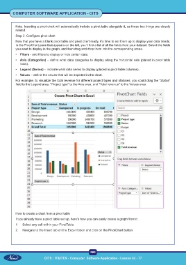
           Now that you have a blank pivot table and pivot chart ready, it’s time to set them up to display your data trends.
           In the PivotChart pane that appears on the left, you’ll find a list of all the fields from your dataset. Select the fields
           you want to display in the graph, and then drag and drop them into the corresponding areas.

           •  Filters - add filters to display or hide certain data.
           •  Axis (Categories) – define what data categories to display along the horizontal axis (placed in pivot table
              rows).

           •  Legend (Series) – indicate what data series to display (placed in pivot table columns).
           •  Values – define the values that will be depicted in the chart.
           For example, to visualize the total revenue for different project types and statuses, you could drag the “Status”
           field to the Legend area, “Project type” to the Axis area, and “Total revenue” to the Values area.


           How to create a chart from a pivot table
           If you already have a pivot table set up, here’s how you can easily create a graph from it:
           1.   Select any cell within your PivotTable.
           2.   Navigate to the Insert tab on the Excel ribbon and click on the PivotChart button.


                                                           260

                             CITS : IT&ITES - Computer  Software Application - Lesson 63 - 77

