Page 274 - CITS - Computer Software Application -TT
P. 274
COMPUTER SOFTWARE APPLICATION - CITS


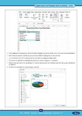
           3  In the dialog box that appears, choose the type of graph you want to create. Here are some recommendations:

           •  Bar charts are ideal for comparing values across different categories or time periods.
           •  Line charts work well for illustrating trends over time or continuous data series.
           •  Pie charts are effective for showing the proportion of each category in a dataset.
           •  Scatter plots are useful for visualizing the relationship between two variables and identifying any correlations
              or patterns.
           4  Once you’ve selected your desired type, click OK.


                                                           261

                             CITS : IT&ITES - Computer  Software Application - Lesson 63 - 77

