Page 274 - CITS - ED - Mechanical
P. 274
ENGINEERING DRAWING - CITS


            Types of Graphs and Their Uses


           Every graph is a visual representation of data. This article describes five common types of statistical graphs widely
           used in any science.
           1  Line Graph
           A Line Graph displays data that change. Every Line Graph consists of data points that are connected. The purpose
           of connecting their lines is to help illustrate a trend, for example, a change or other pattern.
           Uses of Line Graphs (Fig 1)
           When you want to show trends over time, for example, how house prices have increased over time

           When you want to show cumulative growth or increase
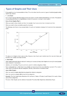
           The following Line Graph shows annual sales of a particular business company for the period of six consecutive
           years:


              Fig 1


           The above Line Graph contains only one line. However, Line Graphs can illustrate more than one set of data, and
           therefore can contain more than one line.
           2  Bar Graph

           A Bar Graph represents discrete data with rectangular columns (or bars). Bar Graphs are among the most popular
           types of graphs in economics,
           statistics, and marketing. They are commonly used to illustrate categories of data.
           Each rectangular bar in a Bar Graph has a height corresponding to the values that they represent. The x-axis of
           a Bar Graph presents the discrete categories, and the y-axis shows a measured value.
           Uses of Bar Graphs
           When you want to display data that are grouped into discrete categories

           When you want to compare differences among categories
           Example: The Bar Graph below illustrates the total sum of Sales of Product A and Product B for each of three
           years (three categories).
           The bars in Bar Graphs can be vertical or horizontal. The above Bar Graph has vertical bars.(Fig 2)


                                                           261
                                    CITS : Engineering Drawing (Mechanical) - Exercise 11

