Page 276 - CITS - ED - Mechanical
P. 276
ENGINEERING DRAWING - CITS


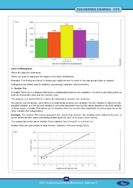
              Fig 4


           Uses of Histograms
           When the data are continuous.
           When you want to represent the shape of the data’s distribution.
           Example: The Histogram below illustrates per capita income for each of five age groups (bins or ranges).
           Histograms are widely used in statistics, psychology, business, and economics.

           5  Scatter Plot
           A Scatter Plot is an x-y diagram that shows a relationship between two variables. It is used to plot data points on
           both the horizontal x-axis and the vertical y-axis.
           The purpose of a Scatter Plot is to show the relationship between two variables.

           Sometimes, but not always, when there is a relationship between two variables, the first variable is called the inde-
           pendent variable, and the second variable is called the dependent because its values depend on the first variable.
           In these cases, a Scatter Plot allows you to visualize how one variable (the dependent variable) depends on the
           other variable (the independent).
           Example: The Scatter Plot below represents the relationship between the monthly sales achieved by each of
           seven stores and the online advertising dollars spent by each of the same seven stores.
           The orange line in the above Scatter Plot is called a “line of best fit” or a “trend line.”
           Scatter Plots are used widely in data science, statistics, and psychology.(Fig 5)


             Fig 5


                                                           263
                                    CITS : Engineering Drawing (Mechanical) - Exercise 11

