Page 275 - CITS - ED - Mechanical
P. 275
ENGINEERING DRAWING - CITS


              Fig 2


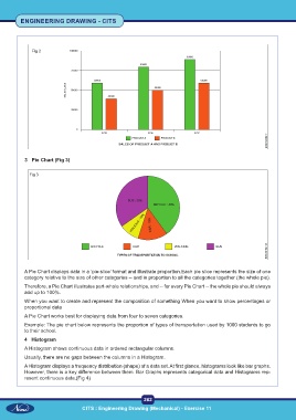
           3  Pie Chart (Fig 3)


             Fig 3


           A Pie Chart displays data in a ‘pie-slice’ format and illustrate proportion.Each pie slice represents the size of one
           category relative to the size of other categories -- and in proportion to all the categories together (the whole pie).
           Therefore, a Pie Chart illustrates part-whole relationships, and -- for every Pie Chart -- the whole pie should always
           add up to 100%.
           When you want to create and represent the composition of something When you want to show percentages or
           proportional data
           A Pie Chart works best for displaying data from four to seven categories.
           Example: The pie chart below represents the proportion of types of transportation used by 1000 students to go
           to their school.
           4  Histogram
           A Histogram shows continuous data in ordered rectangular columns.

           Usually, there are no gaps between the columns in a Histogram.
           A Histogram displays a frequency distribution (shape) of a data set. At first glance, histograms look like bar graphs.
           However, there is a key difference between them. Bar Graphs represents categorical data and Histograms rep-
           resent continuous data.(Fig 4)


                                                           262
                                  CITS : Engineering Drawing (Mechanical) - Exercise 11

