Page 20 - Mechanic Diesel - TT
P. 20
MECHANIC DIESEL - CITS


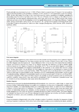
           Pareto principle was developed by Juran in 1950. A Pareto chart is a special type of histogram that can easily be
           apply to find and prioritize quality problems, conditions, or their causes of in the organization (Juran and Godfrey,
           1998). On the other hand, it is a type of bar chart that shows the relative importance of variables, prioritized in
           descending order from left to right side of the chart. The aim of Pareto chart is to figure out the different kind of
           “nonconformity” from data figures, maintenance data, repair data, parts scrap rates, or other sources. Also, Pareto
           chart can generate a mean for investigating concerning quality improvement, and improving efficiency, “material
           waste, energy conservation, safety issues, cost reductions”, etc., as Fig 4 demonstrated concerning Pareto chart,
           it can able to improve the production before and after changes (Montgomery, 2009; Kerzner, 2009; Omachonu
           and Ross, 2004).

              Fig 4


           Fish bone diagram
           Kaoru Ishikawa is considered by many researchers to be the founder and first promoter of the ‘Fishbone’ diagram
           (or Cause and Effect Diagram) for root cause analysis and the concept of Quality Control (QC) circles. Cause
           and effect diagram was developed by Dr.  Kaoru Ishikawa in 1943. It has also two other names that are Ishikawa
           diagram  and  fishbone  because  the  shape  of  the  diagram  looks  like  the  skeleton  of  a  fish  to  identify  quality
           problems based on their degree of importance (Neyestani, 2017). The cause and effect diagram is a problem
           solving tool that investigates and analyzes systematically all the potential or real causes that result in a single
           effect. On the other hand, it is an efficient tool that equips the organization’s management to explore for the
           possible causes of a problem (Juran and Godfrey, 1998). This diagram can provide the problem-solving efforts by
           “gathering and organizing the possible causes, reaching a common understanding of the problem, exposing gaps
           in existing knowledge, ranking the most probable causes, and studying each cause” (Omachonu and Ross,2004).
           The generic categories of the cause and effect diagram are usually six elements (causes) such as environment,
           materials, machine, measurement, man, and method, as indicated in Fig 5. Furthermore, “potential causes” can
           be indicated by arrows entering the main cause arrow (Neyestani,2017).
           Scatter diagram

           Scatterdiagramisapowerfultooltodrawthedistributionofinformationin  two  dimensions,  which  helps  to  detect  and
           analyze a pattern relationship between two quality and compliance variables (as an independent variable and a
           dependent variable), and understanding if there is a relationship between them, so what kind of the relationship
           is (Weak or strong and positive or negative). The shape of the scatter diagram often shows the degree and
           direction of relationship between two variables, and the correlation may have revealed the causes of a problem.
           Scatter diagrams are very useful in regression modeling (Montgomery,2009; Oakland,2003). The scatter diagram
           can indicate that there is which one of these following correlation between two variables: a) Positive correlation,
           b) Negative correlation, and c) No correlation, as demonstrated in Fig 6.
           Flowchart
           Flowchart presents a diagrammatic picture that indicates a series of symbols to describe the sequence of steps
           existing an operation or process. On the other hand, a flow chart visualizes a picture including the inputs, activities,


                                                            7
                                     CITS : Automotive - Mechanic Diesel - Lesson 01 - 04

